Skip to content
001
Website examples · 7 US, 5 UK, 2 AU

Law firm website examples.14 designs, by practice area.

Fourteen homepages for small law firms: seven in the US, five in the UK and two in Australia. Every firm shown is fictional: SmartFirm HQ designed these examples to show what a small firm's site can look like. The firms, people, addresses and phone numbers are made up.

Esta página está disponible solo en inglés.

002
United States · 7 examples

Attorney websites, by practice area.

Personal injury, criminal defence, family law, immigration with a Spanish version, estate planning, employment and bankruptcy, in Houston, Dallas and San Antonio. Each opens as a full homepage in a new tab.

US · Personal injuryHouston · Bold design

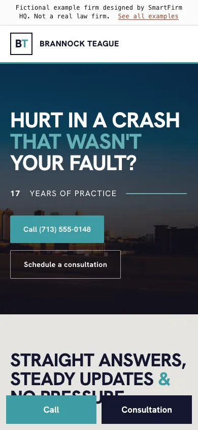
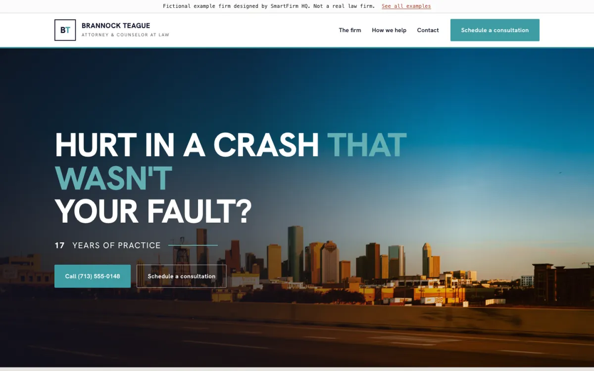
Brannock Teague

What this site does well

  • A one-line headline that names the problem, with the phone number as the first button
  • A call and consultation bar fixed to the bottom of the screen on phones
  • Four plain answers to the questions people call the office to ask
Open the full example ↗ (Brannock Teague, opens in a new tab)
US · Criminal defenceDallas · Warm design

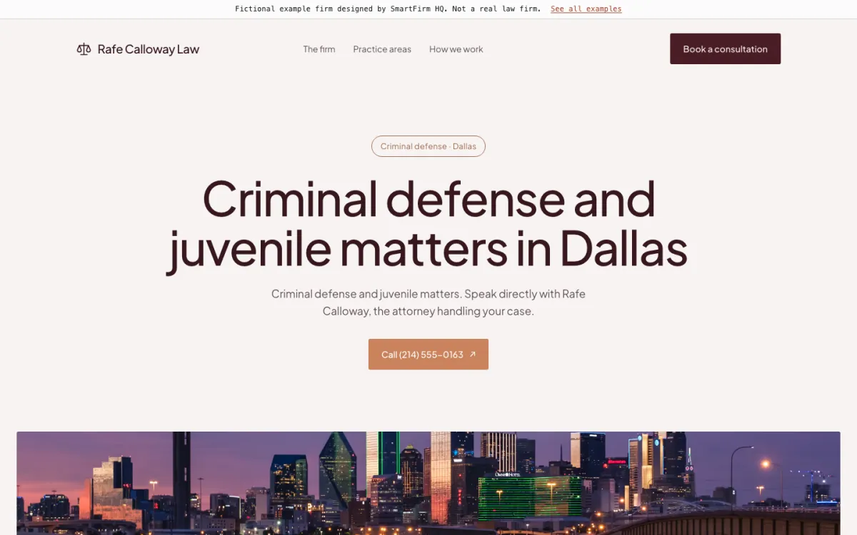
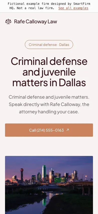
Rafe Calloway Law

What this site does well

  • A light, editorial homepage where the headline and the call button come before any photo
  • Criminal and juvenile cases set out side by side, each with what happens at each stage
  • A contact form that asks for the type of matter and warns people not to send confidential details
Open the full example ↗ (Rafe Calloway Law, opens in a new tab)
US · Family lawDallas · Illustrated design

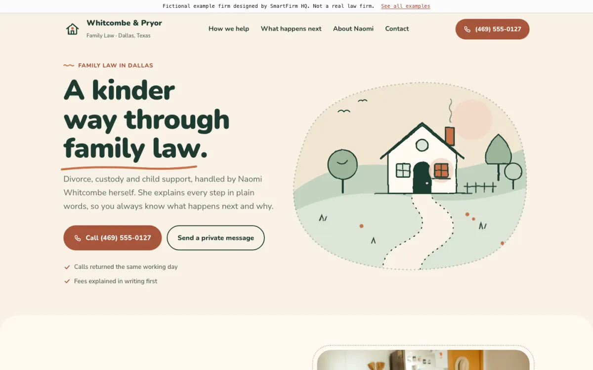
Whitcombe & Pryor

What this site does well

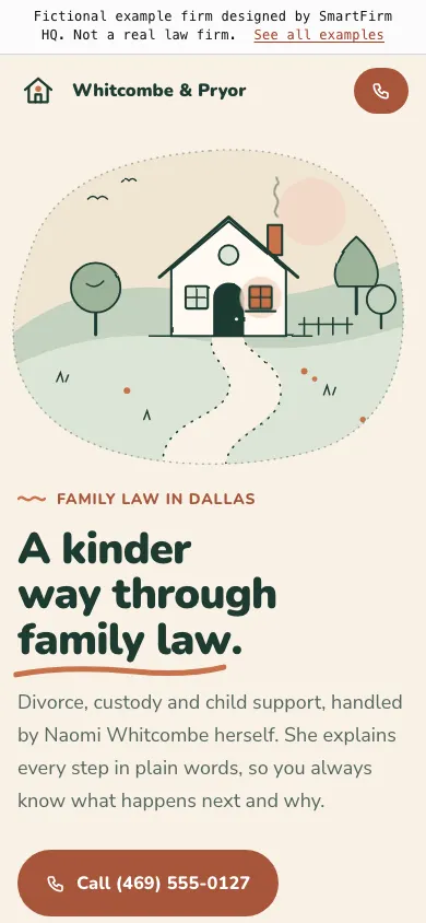
  • A hand-drawn house with one lit window opens the page, with real photos further down in soft rounded frames
  • Six rounded cards, from divorce and custody to protective orders, each explained in one plain sentence next to a photo of an ordinary afternoon at home
  • Three steps from the first call to an order along a hand-drawn trail, with fees promised in writing before work starts
Open the full example ↗ (Whitcombe & Pryor, opens in a new tab)
US · ImmigrationHouston · Bilingual design

Ibarra Solís

What this site does well

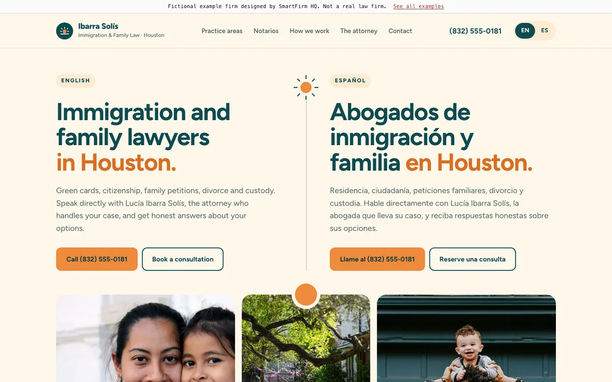
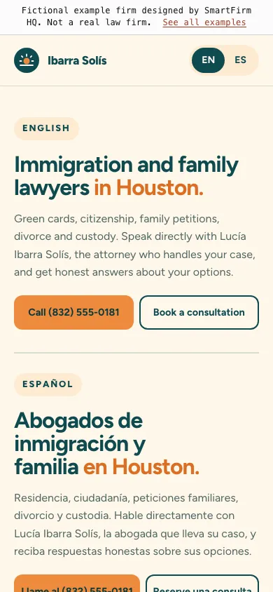
  • English and Spanish side by side in the first screen, with a warm band of family and Houston home photos right under it
  • A “licensed attorneys, not notarios” strip and a short guide to spotting notario fraud
  • A switch that turns every remaining line into Spanish, including the form, the footer and the photo descriptions
Open the full example ↗ (Ibarra Solís, opens in a new tab)
US · Estate planningSan Antonio · Postcard design

Hartwell Estate Law

What this site does well

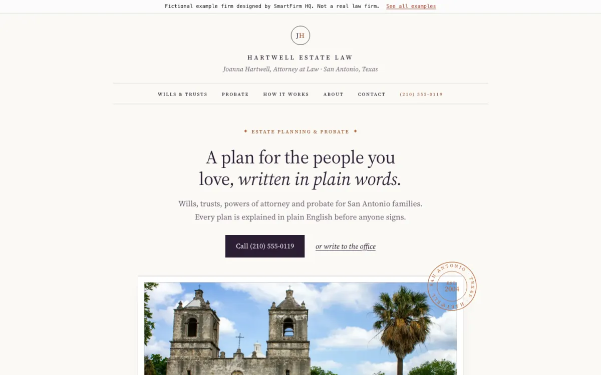
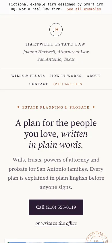
  • A small serif headline above a framed postcard of Mission Concepción, stamped with a San Antonio postmark
  • Three tilted postcards (mission arches, bluebonnets, a front porch) under the About text, the last one offering home visits
  • Wills, trusts, probate and real estate with a one-line plain-words explanation each, and contact laid out like an envelope
Open the full example ↗ (Hartwell Estate Law, opens in a new tab)
US · EmploymentHouston · Sidebar design

Amadi Workplace Law

What this site does well

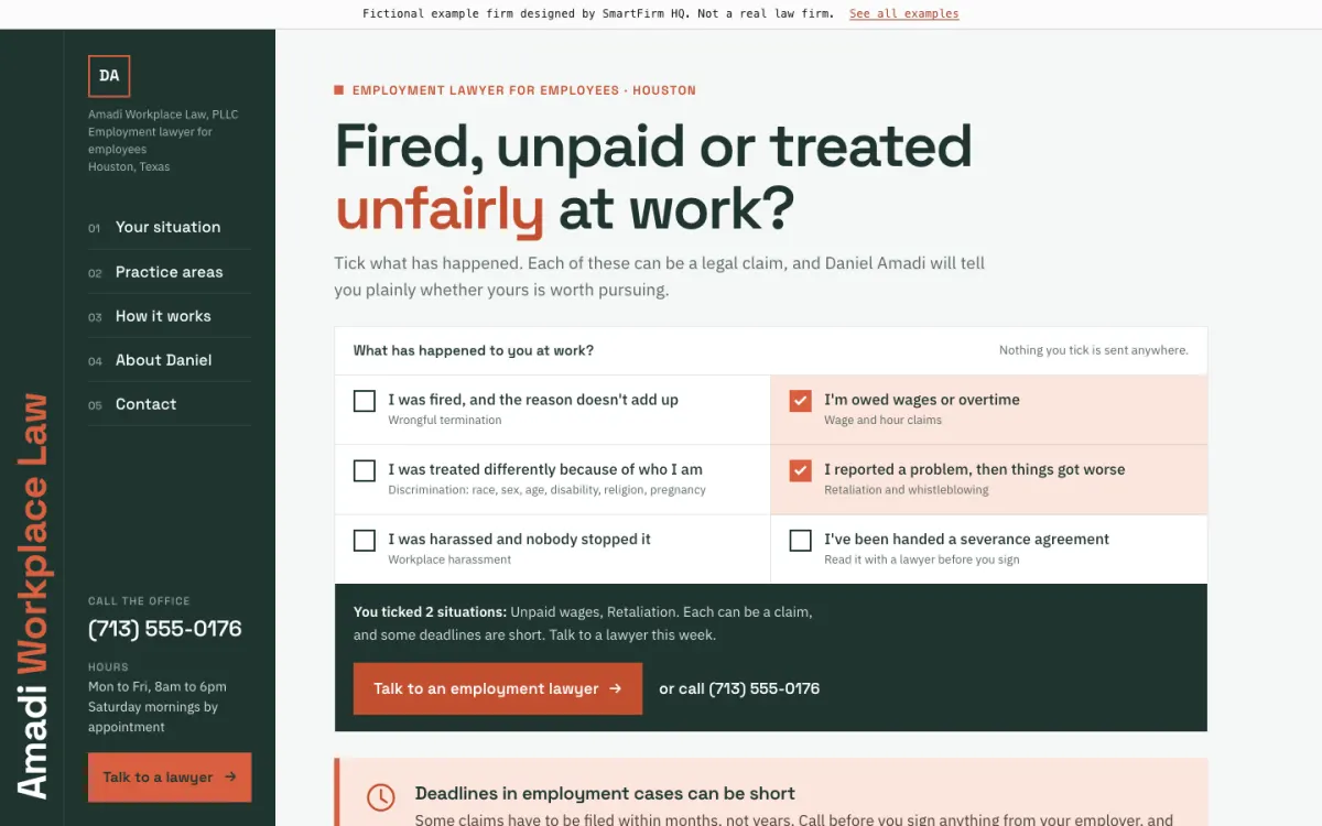
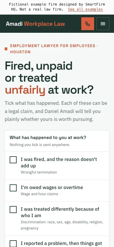
  • A full-height sidebar with the phone, hours and a call button always in view; on a phone it becomes a top bar
  • Six situations to tick (fired, unpaid, retaliation and more) that turn into a short summary for the first call
  • A “what to keep” checklist beside a photo of someone reading a letter from work, and a Houston framing crew heading the facts about the firm
Open the full example ↗ (Amadi Workplace Law, opens in a new tab)
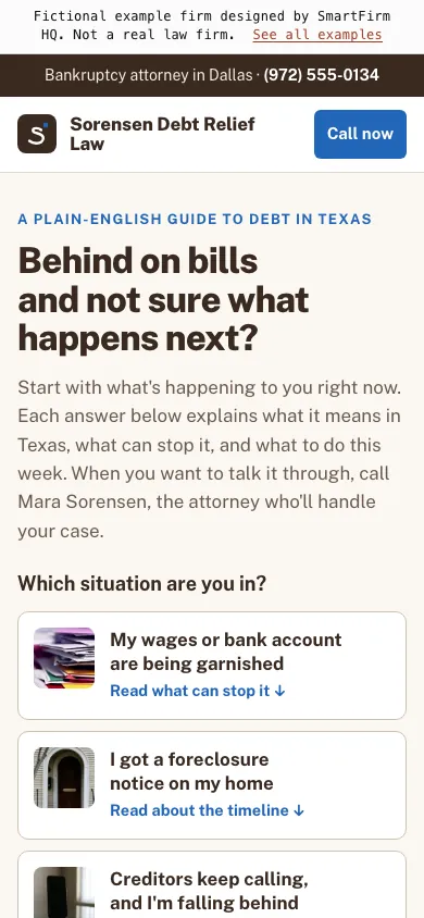
US · BankruptcyDallas · Guide design

Sorensen Debt Relief

What this site does well

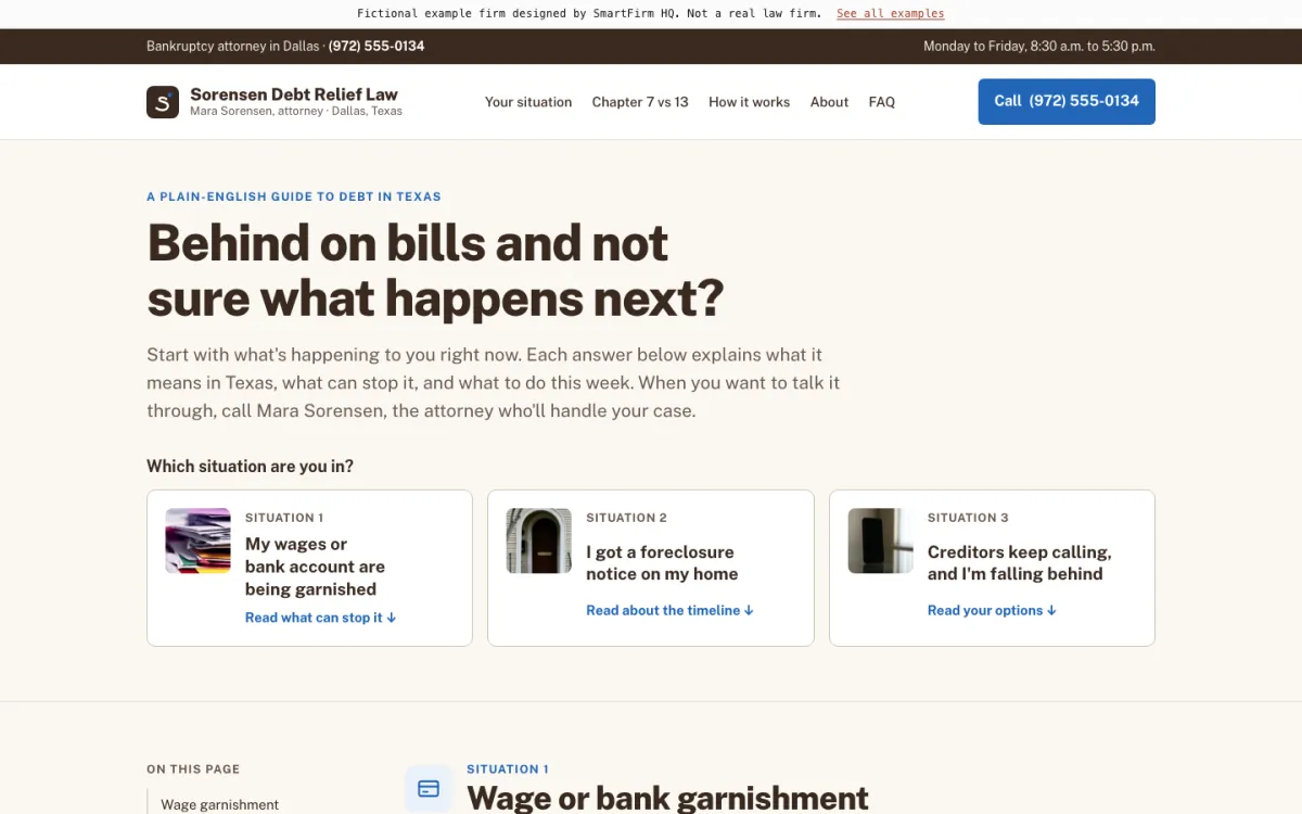
  • Opens with “Which situation are you in?”: garnishment, foreclosure or creditor calls, each with a small photo that leads to its own answer
  • Each photo has a practical caption, such as keeping every letter with the date it arrived
  • Chapter 7 and Chapter 13 compared side by side, turning into stacked cards on a phone
Open the full example ↗ (Sorensen Debt Relief, opens in a new tab)
003
United Kingdom · 5 examples

Websites for firms in England.

Residential conveyancing, family law, immigration, wills and probate, and employment, in London, Manchester, Birmingham and Leeds. The UK examples include the complaints, fees and regulatory sections a firm regulated by the SRA is expected to show, with the register number left as a marked placeholder.
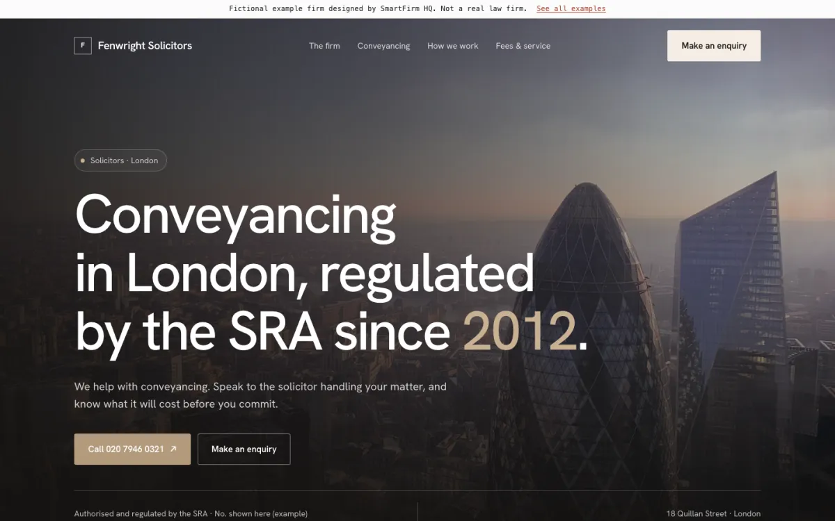
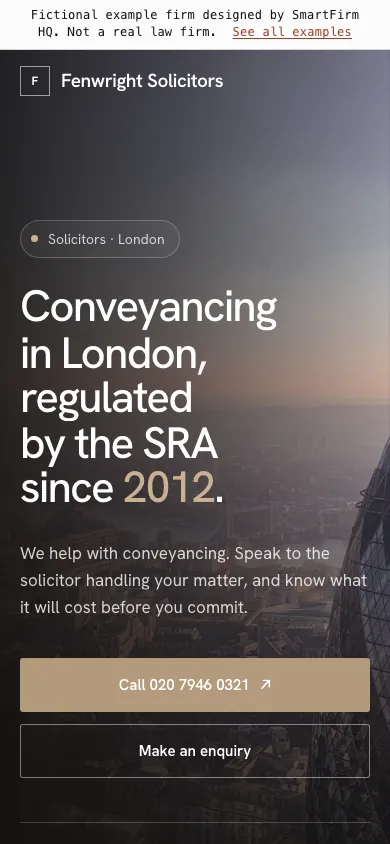
UK · Residential conveyancingLondon · Animated design

Fenwright Solicitors

What this site does well

  • A fees and service section laid out for the SRA Transparency Rules, ready for the firm’s own figures
  • A phone in the page that plays an example evening enquiry about a house purchase
  • Buying, selling, remortgages and transfers of equity each explained in one line
Open the full example ↗ (Fenwright Solicitors, opens in a new tab)
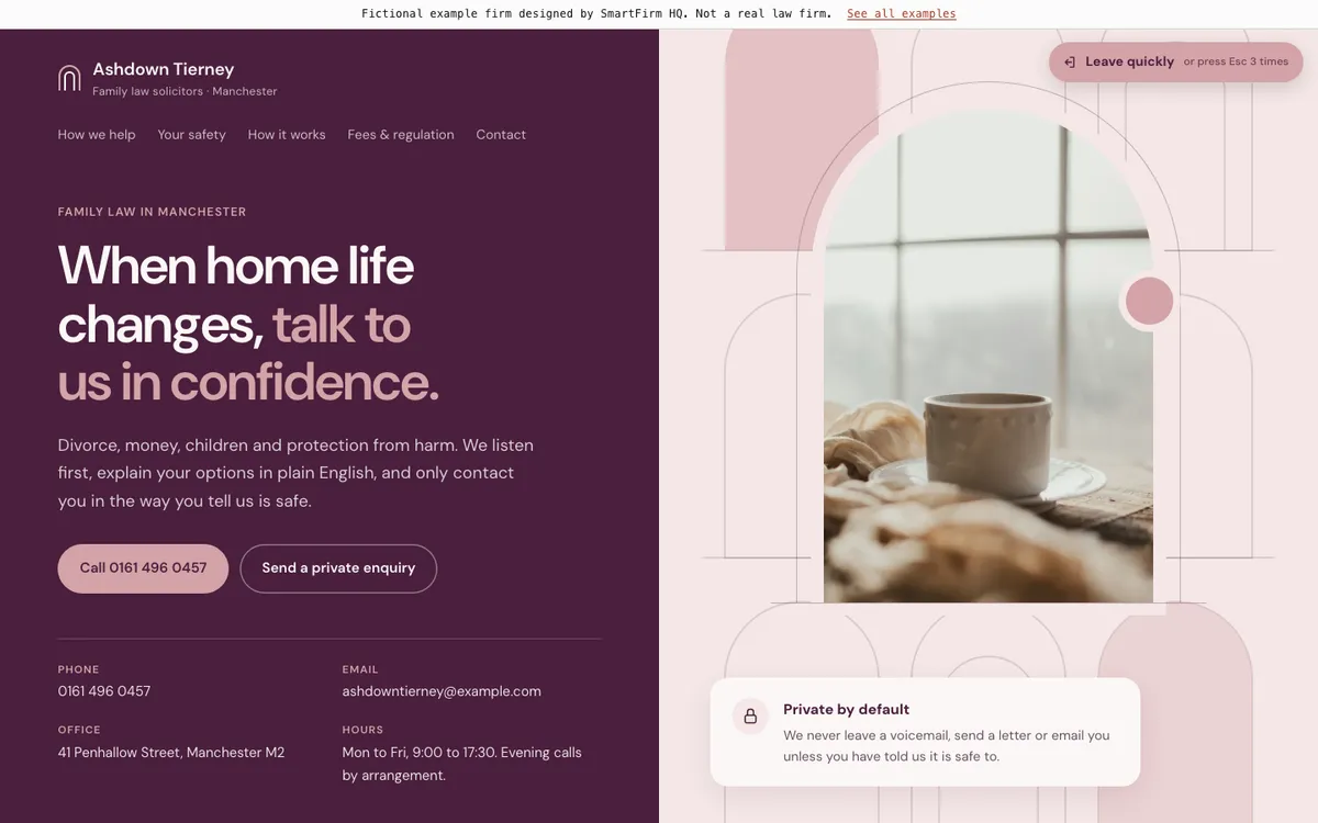
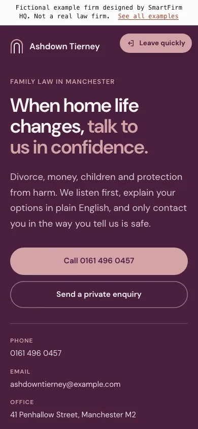
UK · Family lawManchester · Split-screen design

Ashdown Tierney

What this site does well

  • A calm photo of tea by a window, set inside the site’s arch shapes, with “Private by default” written beside it
  • A “Leave quickly” button on every screen (Esc three times works too), and a private form that asks for a safe number, a safe time and whether a voicemail is OK
  • A section on contacting the firm without being seen, next to divorce, money, children and protection
Open the full example ↗ (Ashdown Tierney, opens in a new tab)
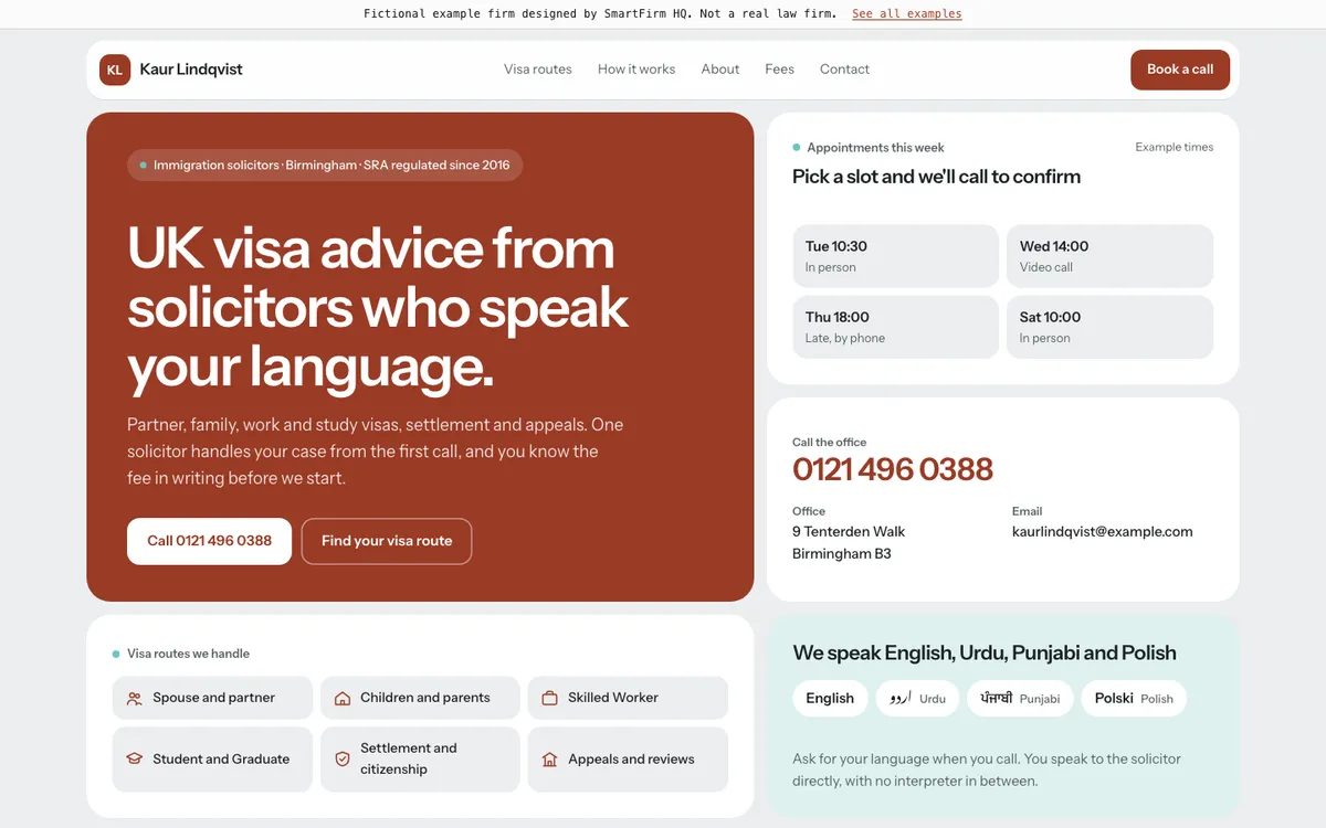
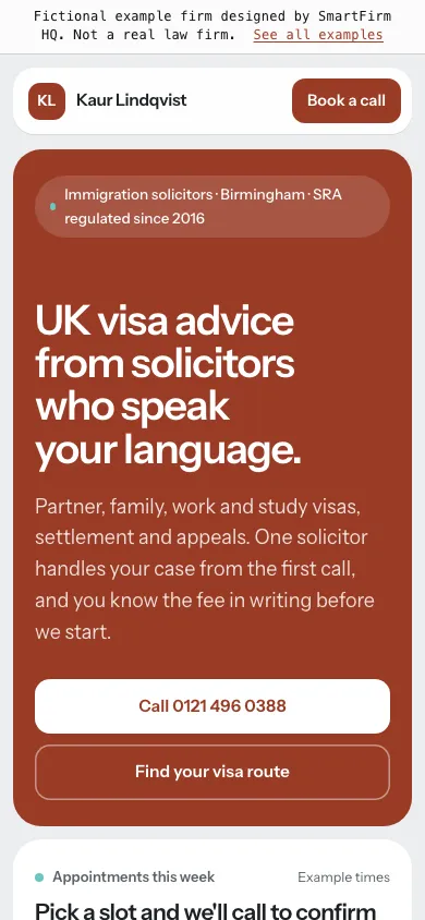
UK · ImmigrationBirmingham · Tile design

Kaur Lindqvist

What this site does well

  • An app-like grid of tiles, with photos set inside the partner, family and office tiles as rounded panels
  • Tapping one of this week’s appointment slots fills the preferred appointment on the form and scrolls to it
  • Language chips in English, Urdu, Punjabi and Polish, written in each language’s own script
Open the full example ↗ (Kaur Lindqvist, opens in a new tab)
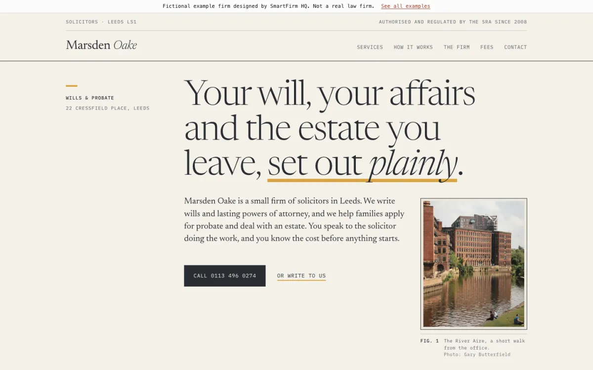
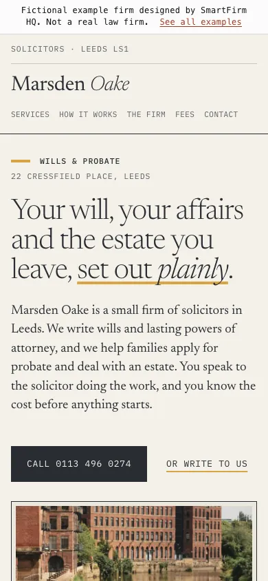
UK · Wills and probateLeeds · Editorial design

Marsden Oake

What this site does well

  • Set like a printed booklet: a serif headline, numbered sections and thin rules, with photos framed as numbered plates
  • A real Leeds view, the River Aire mills, beside the opening text, so the firm feels local before you read a word
  • A price and service table per service, next to the SRA details, complaints and Legal Ombudsman text
Open the full example ↗ (Marsden Oake, opens in a new tab)
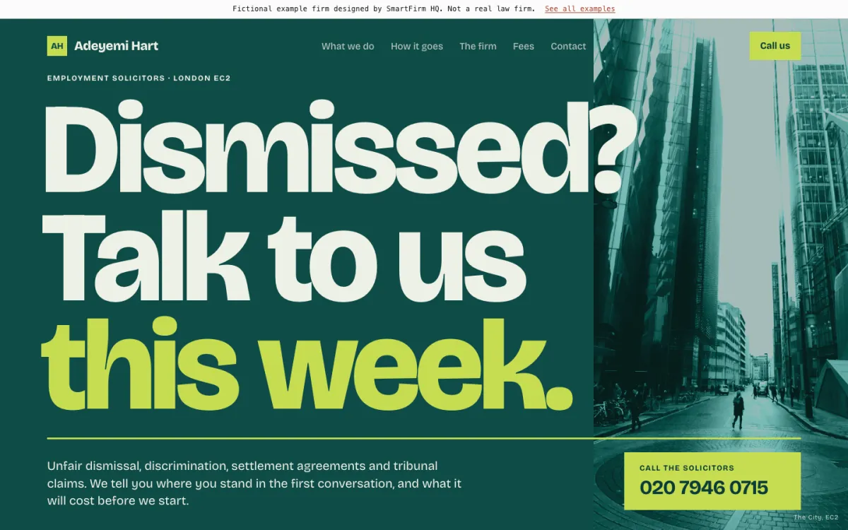
UK · EmploymentLondon · Poster design

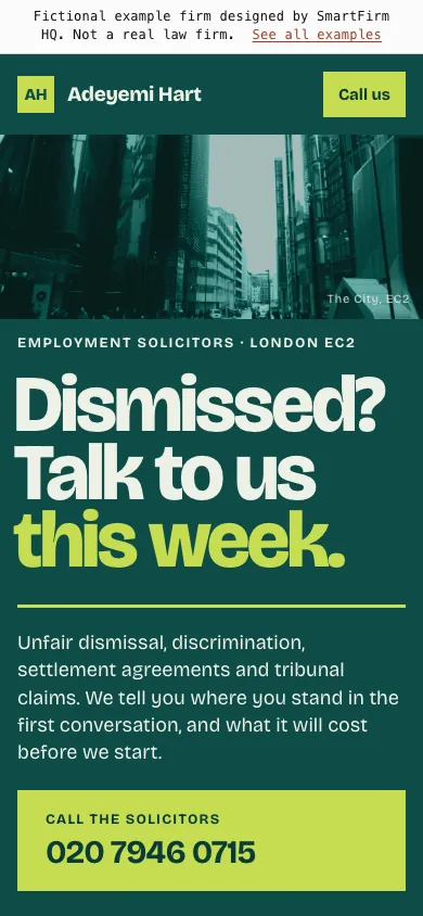
Adeyemi Hart

What this site does well

  • A full-screen headline, “Dismissed? Talk to us this week.”, running over a City street photo toned in the firm’s green
  • Photos toned in the brand colour, so they sit inside the design rather than on top of it
  • Four heavy service blocks that swipe sideways on a phone, and a band on tribunal time limits
Open the full example ↗ (Adeyemi Hart, opens in a new tab)
004
Australia · 2 examples

Websites for Australian law practices.

Family law in Sydney, and wills and estates in Melbourne. The Australian examples name the state’s professional body for lawyers and explain the written costs disclosure in plain words, with no numbers or prices.

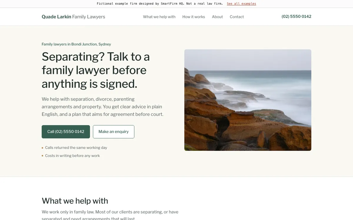
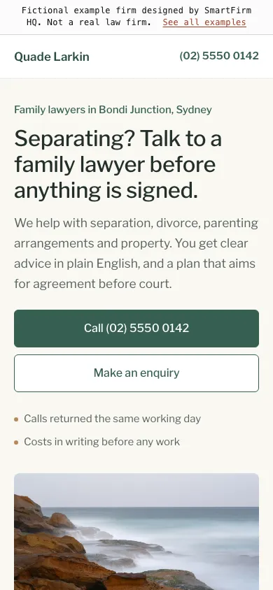
AU · Family lawSydney · Simple design

Quade Larkin Family Lawyers

What this site does well

  • A plain first screen: one clear sentence, a call button, an enquiry button and a calm photo of the Sydney coast
  • Four short cards say what the practice helps with, followed by a plain line on calling 000 if someone is in danger
  • A private enquiry form that asks for a safe phone number, after three simple steps that explain how working together goes
Open the full example ↗ (Quade Larkin Family Lawyers, opens in a new tab)
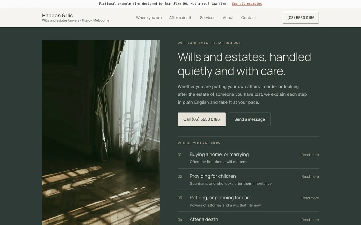
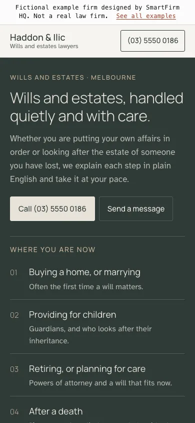
AU · Wills and estatesMelbourne · Quiet design

Haddon & Ilic

What this site does well

  • Muted colours, light type and a photo of morning light through a curtain, for people planning ahead or grieving
  • A “Where you are now” list in the first screen, including a gentle line for families after a death
  • A short checklist for each life stage, with “good to know” notes and a written estimate before any work
Open the full example ↗ (Haddon & Ilic, opens in a new tab)
005
The pattern

What the best law firm websites have in common.

Good lawyer website design is less about decoration than about making the next step obvious. These are the things every example above is built around.

01

A phone number in the first screen

Many people look for a lawyer on their phone. A number they can tap to call, near the top of the page, is the shortest route to an enquiry.

02

One page for each type of matter

A page each for divorce, a house purchase or a visa lets visitors confirm you handle their problem, and gives Google something specific to show for that search.

03

Plain words, in the client’s language

Visitors are often worried or in a hurry. Short sentences about what happens next do more than a list of credentials, and a Spanish (or other) version helps where your clients speak it.

04

What happens after they get in touch

A short section on the first call, the first meeting and how fees are explained answers the question people are too nervous to ask.

05

Firm details that match everywhere

The firm’s name, address, phone number and hours should be the same on the site, the Google Business Profile and every directory.

06

Regulatory information where it’s expected

In England and Wales, the SRA requires its digital badge on a firm’s site, and price and service information for some services. US firms follow their state’s attorney advertising rules.

07

Fast and readable on a phone

Large text, buttons big enough to tap and pages that load quickly on a mobile connection. Every example here is built for a 375-pixel screen first.

08

Forms that ask only what’s needed

Name, phone, email, the type of matter and a short message, with a line saying that sending it does not make someone a client.

09

A way to reach the firm out of hours

Many enquiries arrive in the evening. A form that reaches the right inbox, or an assistant that takes details for a call back and never gives legal advice, means those enquiries aren’t lost.

006
Questions

Questions about the examples.

Are these real law firms?

No. Every firm, person, address, phone number and email address on this page is fictional. SmartFirm HQ designed the examples to show what a small firm’s site can look like. The phone numbers come from ranges set aside for fiction, and the email addresses use example.com.

Can my firm’s website look like one of these?

Yes, as a starting point. Every site is built around your own services, logo and colours, and you approve the design before it goes live. Send us your firm’s name and city and we’ll build a free preview of your homepage.

How long does a site like this take?

Your site is live within 7 days of your two approvals: one for the design and one for the finished site, with every form, call button and connection tested at launch.

Why don’t the examples show reviews?

Reviews on a website should come from real clients, so the fictional firms have none. On a real site we can link to your Google reviews, within your regulator’s rules on publicity.

How much does a website like this cost?

One clear price, given on a 15-minute call. Add-ons such as SEO or missed-call text-back are scoped separately.

007
The next step

See your new site before you decide.

Send us your firm’s name and city and we’ll build a free preview of your new homepage, or book a 15-minute call.

Get my free preview